This month marks one year since the renovation was finished on our first home. It is hard to believe that we’ve already lived here for a full year–and that we’ve owned our own place for a bit longer than that!
The first year of home ownership is not without its trials. There have been quite a few times when Sona and I have looked at each other, asking “What did we get ourselves into?”
Still, I am totally smitten with our little Chicago duplex. And though it’s a work in progress, it has come a long way.
I started blogging about our first home last year. I posted photos of the house as it was the day we first saw it, complete with our reno plans. Then, I posted the before and after photos of our living room/dining room.
In honor of our home-iversary, I’m going to get back to the before and afters. Today, I’m sharing the changes we made to our master bedroom and bathroom.
So, let’s start with a reminder of what we saw the first time we every walked into the house:
The two upstairs bathrooms were the most dated part of the house. (The downstairs bathroom was much better, and it’s still the only room that remains untouched. Hopefully, we’ll get to that, soon.)
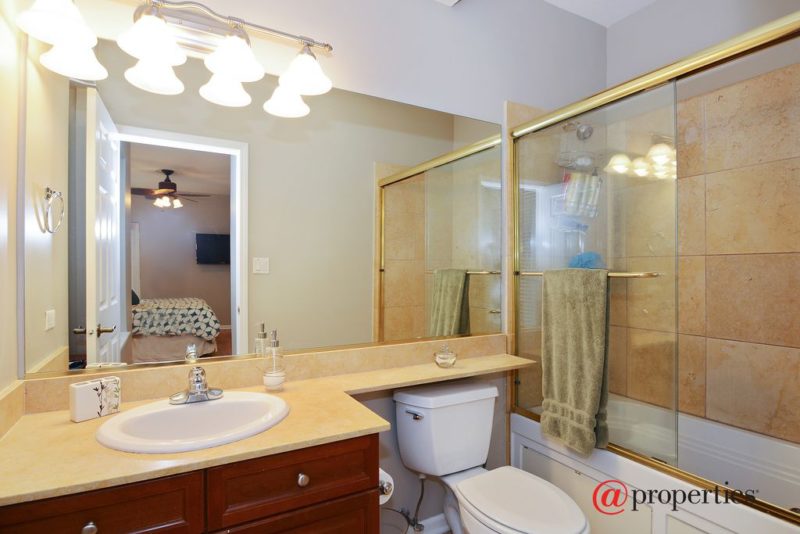
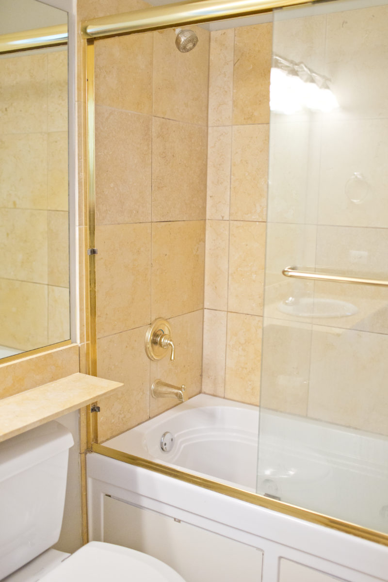
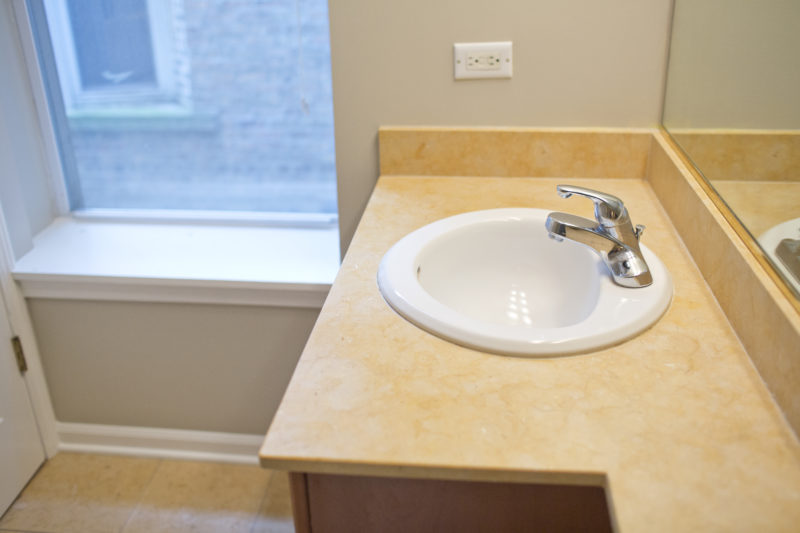
The master bath was small, and the functionality suffered. It also had an ancient whirlpool tub that was: 1. Gross. 2. Not working. 3. Not even a little cute.
We knew we wanted to gut the bathrooms. It was a condition of our buying the place.
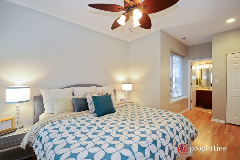
Here are photos from the day we got the keys. As you can see, the bedroom was fine. Nothing special, nothing terrible.
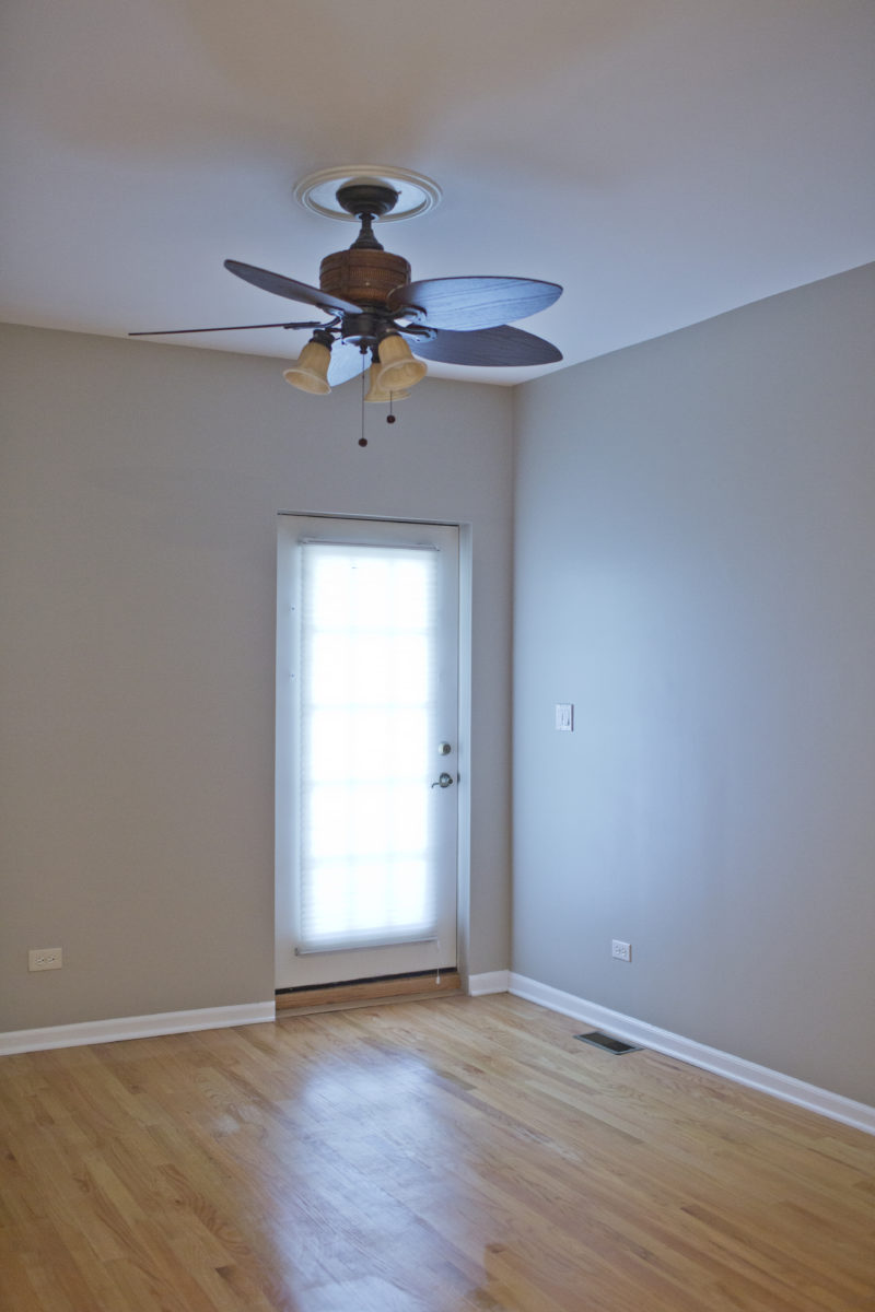
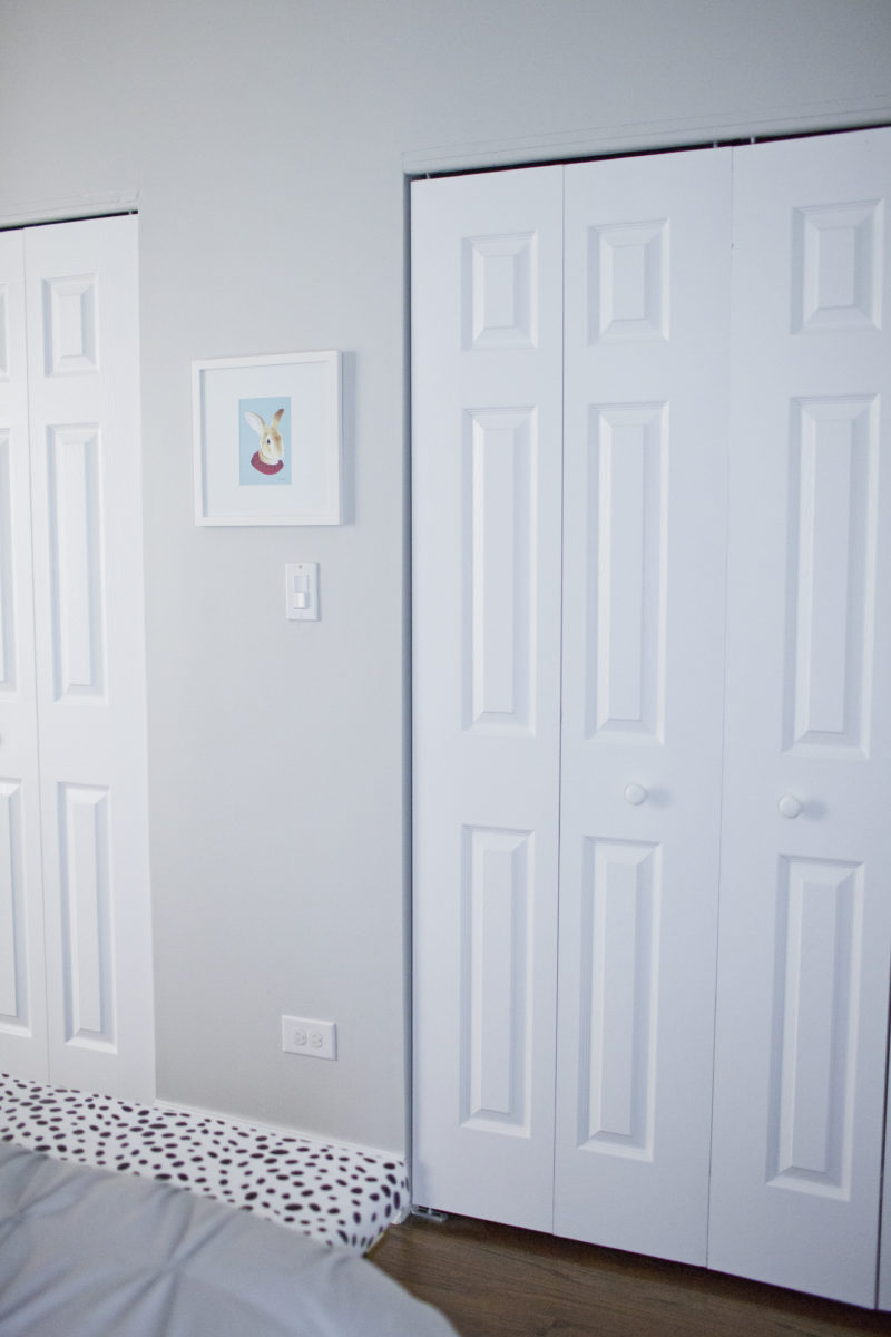
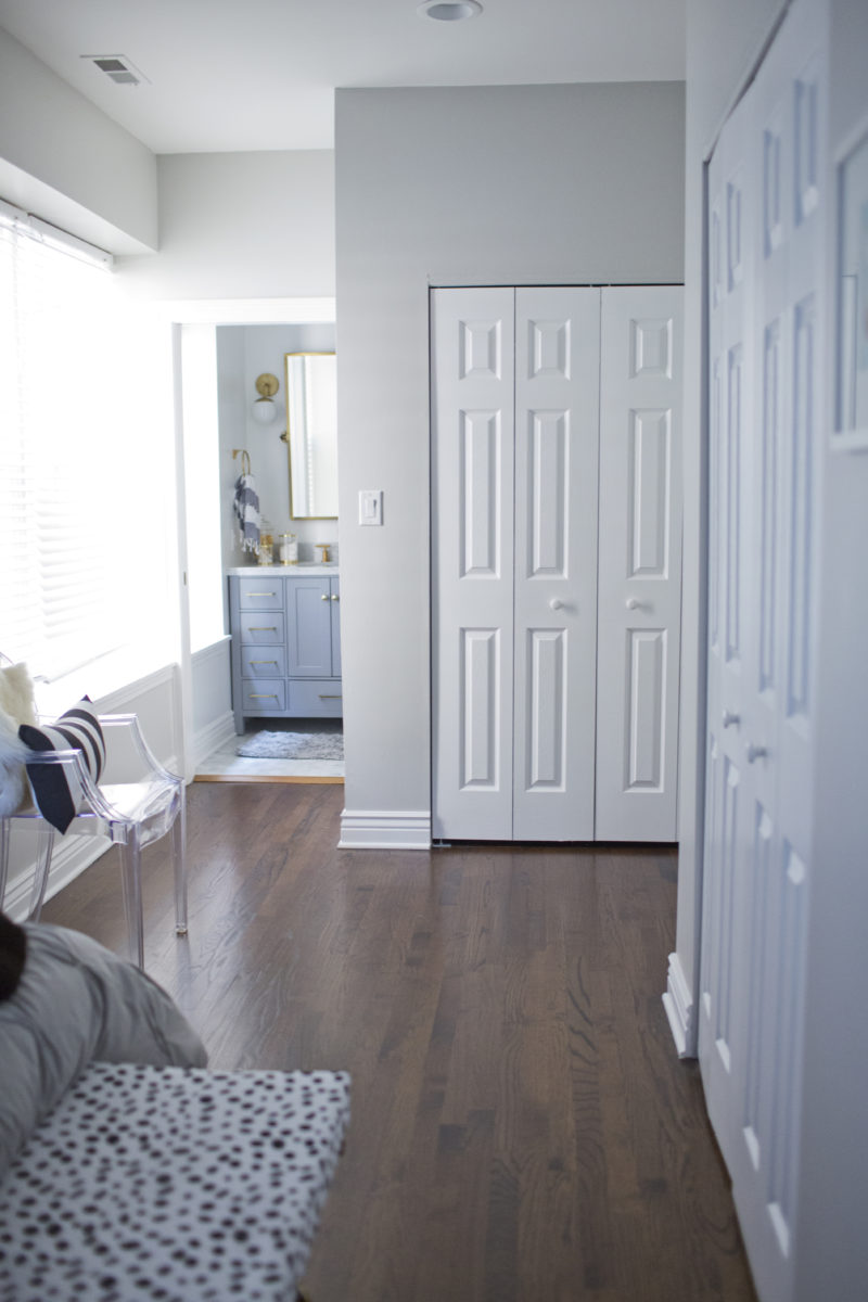
The room is moderately sized, but there are three huge closets. That is great, as Sona and I have had to split our clothes between two rooms in the past. However, it also means that 75% of the wall space in the bedroom is occupied by closet doors, leaving little space for furniture.
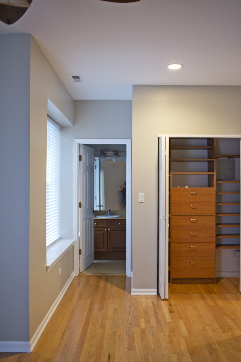
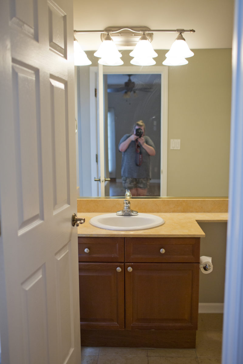
These photos literally make me cringe, still.
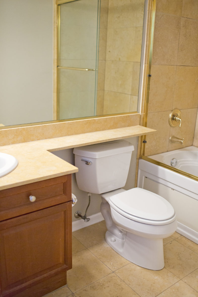
When we had contractors come give bids, they all shook their head in confusion at the tub, which was beyond salvaging. (We got a small credit for it in closing costs.)
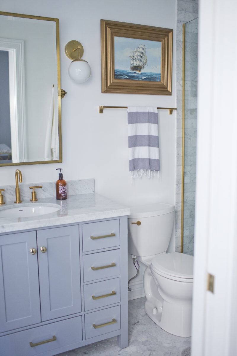
And now, here’s what the bathroom looks like today:
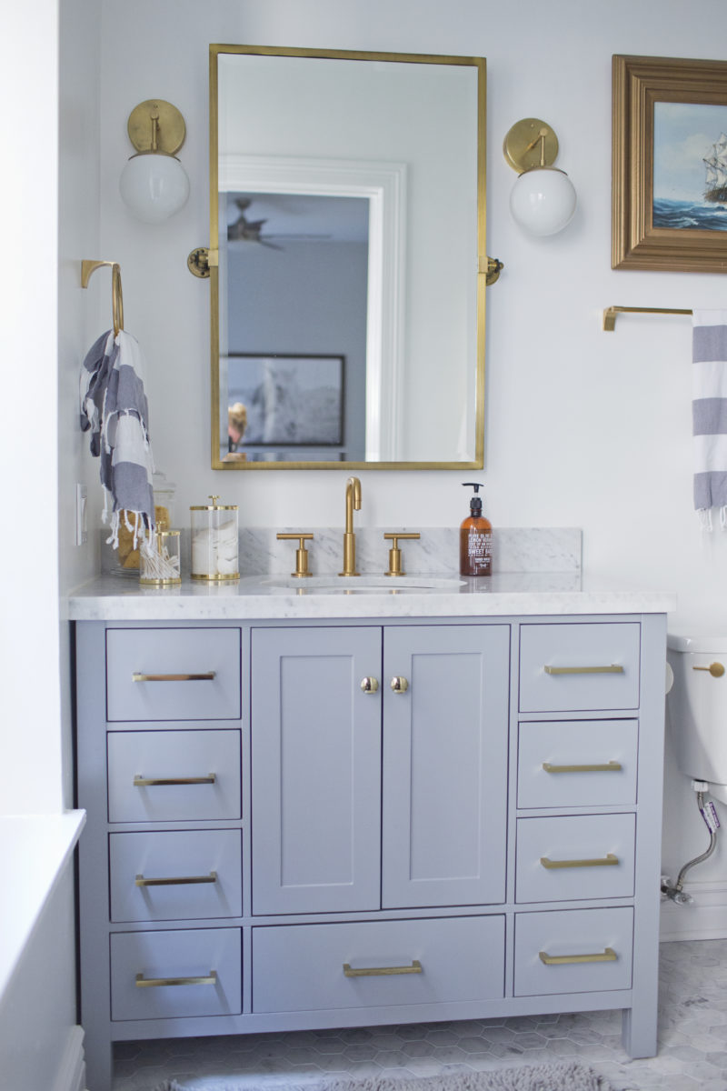
Can you get over the difference?! We completely gutted the room. At first, we’d planned to expand the footprint into one of the closets, but then decided against it when we realized how much it would cost. Sona and I are accustomed to sharing a small bathroom, and a large master bath was never on our home-buying wishlist. So, we decided to make the best of the small space, choosing more high-end finishes to make the little bathroom feel special.
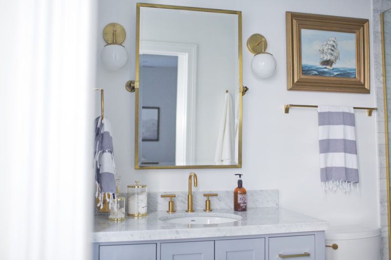
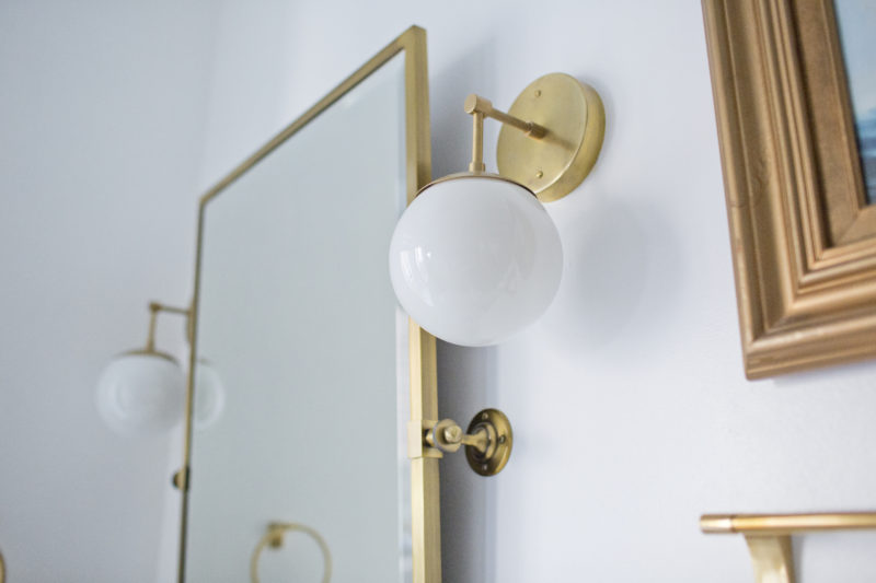
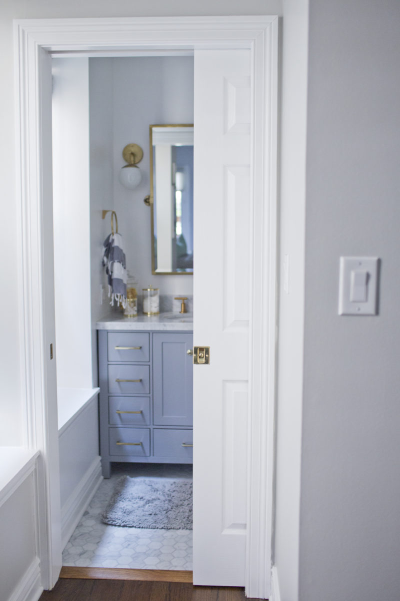
These light fixtures were one of the first things we knew we had to have in the new place. And the vanity was one of the things we refused to compromise on. It was actually back-ordered and didn’t come until a month after everything was finished, but we just couldn’t find another that we loved as much. Our contractor, who we LOVE, just furrowed his eyebrows, wondering why we wouldn’t just “go pick another one.” But he also knew us well enough, by then, to know that we wouldn’t change our minds.
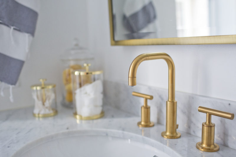
It originally had silver hardware, but I swapped it all out for gold. Of course.
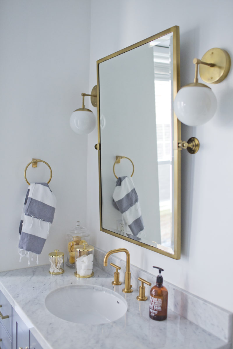
I really debated going with the gold fixtures, which are a bit trendy, and I suspect they may be outdated when we sell. But I love them SO much, and Sona convinced me to do what makes ME happy–not what the market would like in seven years. So, we went with gold in both upstairs bathrooms and all lighting fixtures throughout the house. I think it’s just that little something unexpected that makes the bathrooms pop.
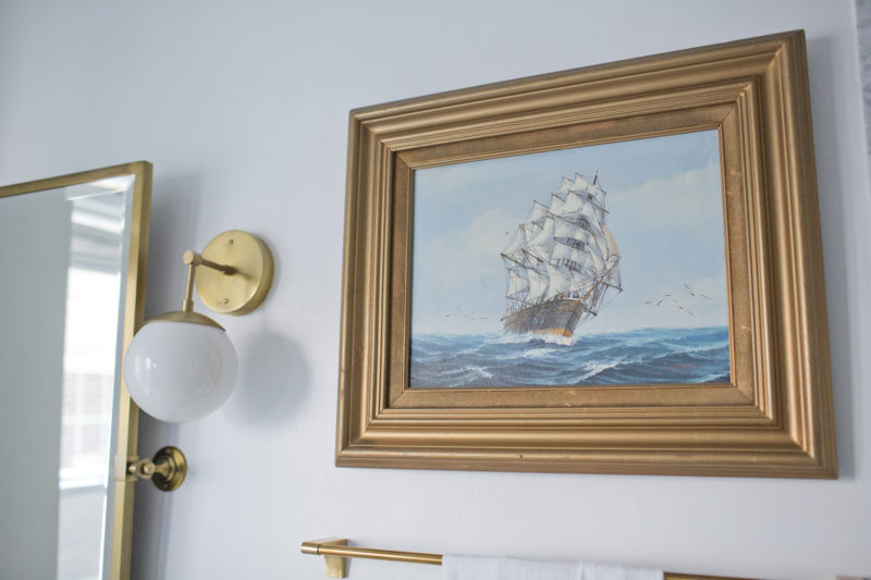
The bathroom is bright, but it is also can feel very cold. (I love cool tones. So, that doesn’t really bother me.) Still, I knew I wanted a vintage oil painting to warm it up a bit and to tone down some of the new-ness. We searched and searched for months before finding this guy on eBay for like $50–frame and all! I love him. I also need a couple of small plants to give some life to the space.
Early on, Sona and I fell in love with bathrooms done in carrara marble. We decided to use it for a walk-in shower, which replaced that horrendous tub. Then, we started hearing/reading about how much of a PIA marble can be in a bathroom. It’s a very temperamental stone, and it requires a good bit of TLC to keep it looking good. Even still, it is inevitable that the stone will stain, etch, and scratch over time. We had several conversations about whether or not to pull the marble plug, but we ultimately decided that we were willing to do the maintenance for a bathroom we love. We still don’t regret that decision, even though marble is a total pain in the butt and has caused me more stress than pretty much anything else in my life. (True story.) I’ve cried over this marble on more than one occasion, as ridiculous as that sounds. It’s my second child.
When we re-do the guest bathroom downstairs, we probably will use a more people-friendly and water-friendly tile, but I’m glad that we decided to go for it in our own bathroom.
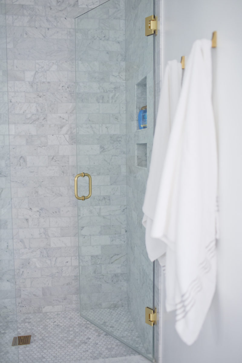
We also did custom shower doors, which also makes a huge difference in the overall aesthetic. Using gold hardware, obvs.
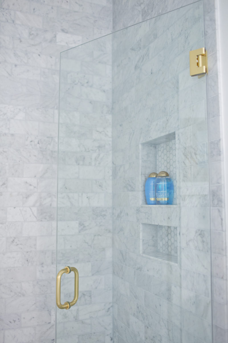
All of our fixtures are from Kohler’s Purist line and are in the color “Vibrant Moderne Brushed Gold.” Again, they were pricey, but in such a small space, they make a huge impact. Also, we looked everywhere for less expensive alternatives, and nothing matched up.
The one architectural element that we did change in the bathroom–other than adding new baseboards–is that we had a pocket door installed. Talk about a little change making a HUGE impact! The previous door opened to the left, completely blocking the large window, which is the only source of natural light in the bathroom. Now, not only does the door not get in the way, but we also have a full-view of that glorious window.
Let’s move on to the bedroom…
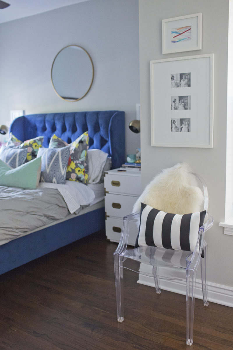
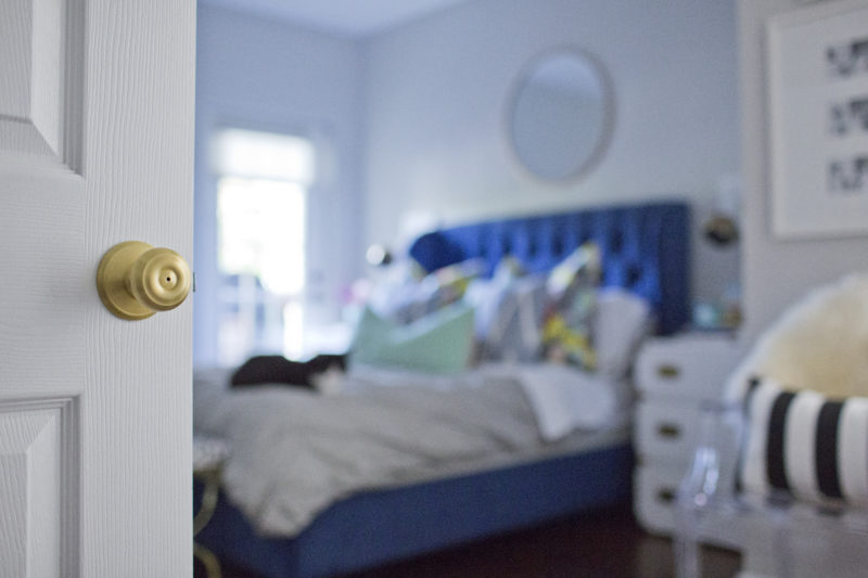
We made a few changes in the bedroom: First, we painted the walls grey. (They were beige.) Then, we added new baseboards and casings around the doorways. Finally, we stained the floor. This room is actually the only one in the entire house (aside from the downstairs bath) that still has the same flooring as when we purchased the home. The rest of the top floor now has new hardwood, as the existing hardwood was from 1916! The bedroom flooring, however, had been replaced at some point. So, it was much newer, and it was considerably cheaper to sand and stain it, rather than replace it.
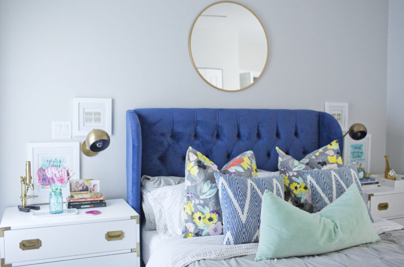
We also had sconces installed around the bed. They are from Schoolhouse Electric, where we got all of the lighting in the house.
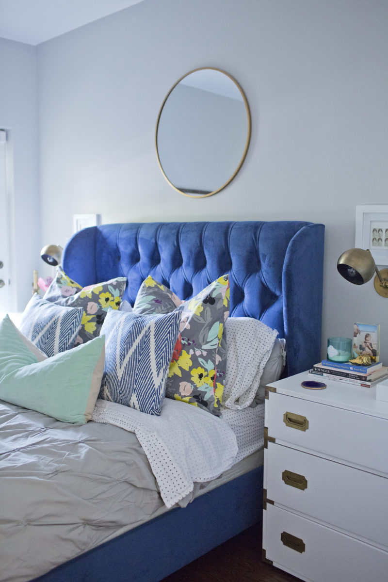
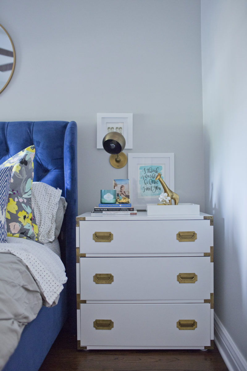
For the past several years, in anticipation of moving, I fantasized about buying two things: a fiddle leaf fig (which I did–as you can see in the living room post) and vintage campaign nightstands. I lusted after these babies for YEARS, inspired by very similar ones that DIY Playbook (a GREAT Chicago design duo) posted. I stalked MegMade’s website. (They are a great vintage reno shop. We’ve purchased several pieces from them in the past.) As soon as two matching campaign nightstands became available, we snatched them up and had the refinished in white! They are two of my favorite pieces in our home.
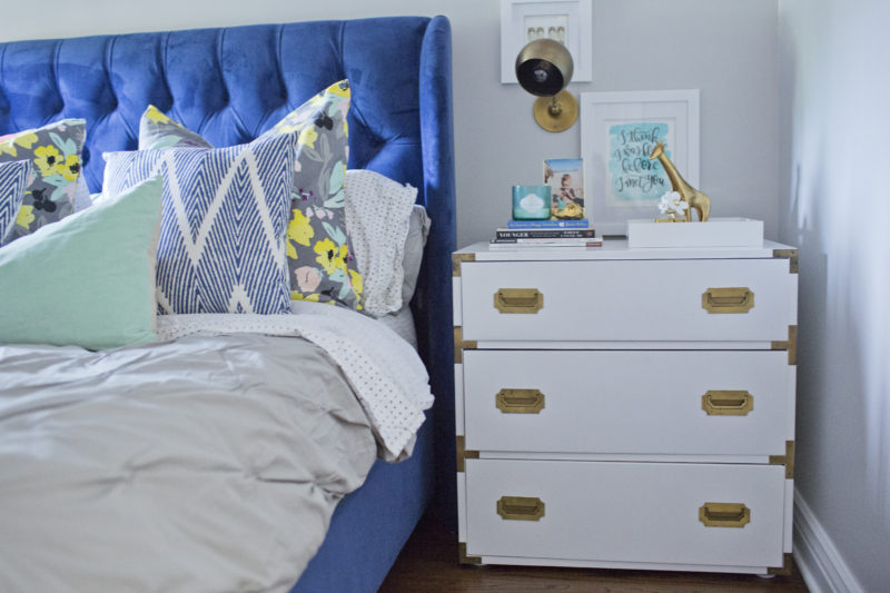
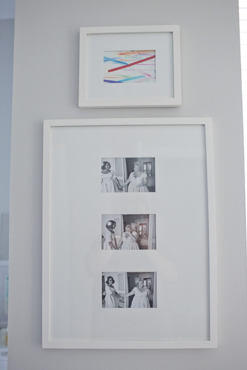
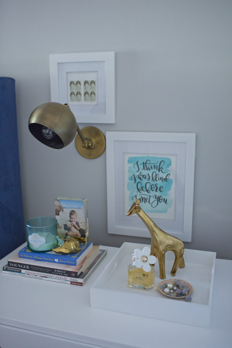
The artwork over the nightstands leftover are vintage stamps from our wedding invitations, which I framed (Ralph Waldo Emerson for Sona and Emily Dickinson for me) and custom calligraphy prints with the lyrics from our first dance song (First Day of My Life by Bright Eyes).
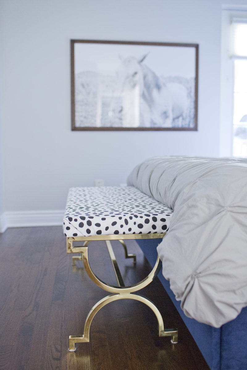
We also have a huge print of this horse photo, which I took in North Carolina. It’s for sale in my Etsy shop.
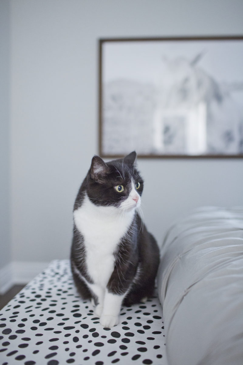
I bought this bench on Wayfair for a steal, and I recovered it with this Dalmatian printed fabric, which I’m kind of obsessed with.
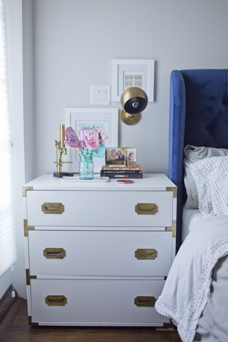
Sona isn’t as interested in home design as I am. She definitely likes for our home to look nice, but she doesn’t often come up with ideas on her own. However, she was adamant that we find something for her nightstand that represented who she is and what she loves. So, she was super excited to find this vintage brass microscope at a local flea market. It’s the one thing that SHE had to have!

Cat photo-bomb, here.
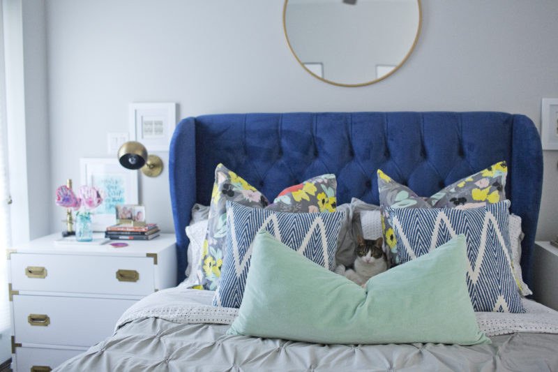
I also love the mixed prints in our bedroom. Of all the rooms in our home, this is the one that feels the most complete to me. It’s also the one where I think I really nailed my style. You know, it can be difficult to figure out exactly what your personal style is, and we’ve waffled a lot over the years, experimenting with shabby chic and beachy and uber modern. Ultimately, this room really captures us perfectly: colorful, whimsical, a little new, and a little old. It’s interesting and eccentric but clean and uncluttered.
But we do need a new duvet. Thanks for ruining everything, cats.
Kitty #2. I told him that, since he matches our bench, we can keep him. 😉
Eventually, we would like to take this wall of closets, open it up, and do custom built-ins with sliding frosted glass doors and a hidden spot for a TV. For now, I relish not having a TV in the bedroom. (Sona, not so much.)
Next up… our kitchen!
Stunning!! Wow, I am blown away.