It’s been a while since I’ve posted any house updates. So, I thought I’d share the results of our somewhat unexpected bath reno, which we did this past November.
I’ve posted a bit about our home, which we’ve now owned for almost two years, before, including the before and after photos of our master bedroom and bath reno, before and after photos of our living room/dining room reno, and photos of the move-in condition, along with our original reno plans.
I need to get around to posting a lot more home-related stuff, because I’m pretty behind. Let’s start with this most recent project.
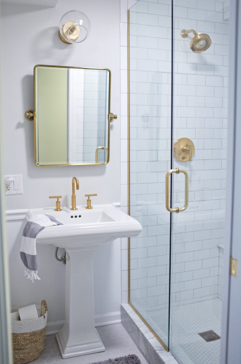
This is our guest bathroom, which is downstairs and across from our third bedroom, today.
Sadly, I don’t have a ton of before photos, as it was clearly the least-photographed room in our house. I pulled this one from the original realtor’s listing:
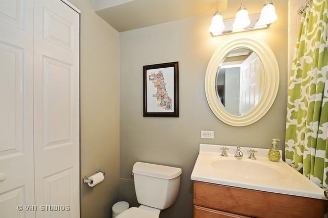
As with all realtor’s photos, this picture really does this tiny little bathroom a little too much justice.
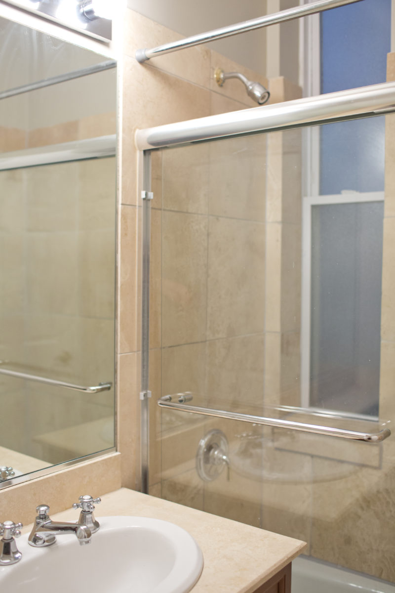
The shower, which I don’t have a photo of, was a bath/permanent glass shower door relic, almost exactly like Finn’s old bathroom (which we’ve also renovated), originally pictured here:
This was the view of the bathroom door upon move-in. You can see how the door inconveniently swung open into the bathroom and blocked the entrance to the shower. Basically, you couldn’t even use the bathroom without the door shut. It just didn’t make any sense. Adding a pocket door, which we’ve done to all bathrooms in the house, made a world of difference.
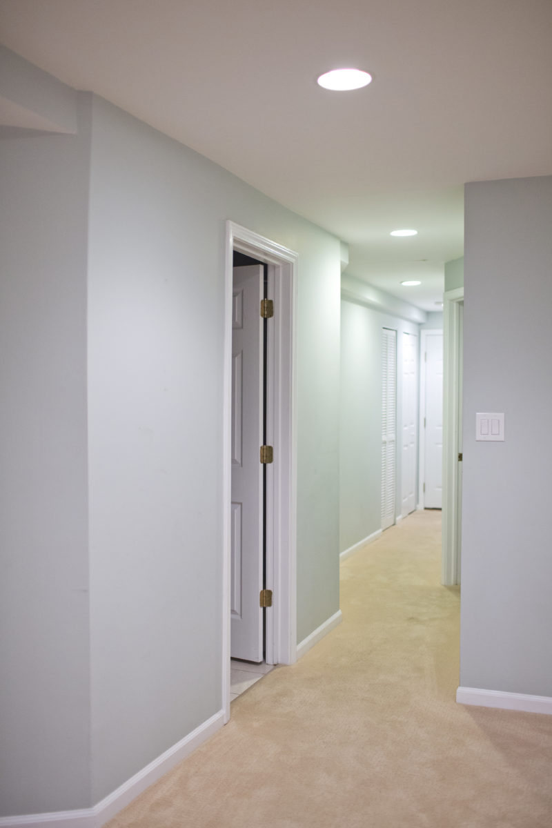
The third bathroom was, upon move-in, the least in need of immediate attention. And, since we’d already stretched our reno budget with the rest of the house, it ended up being the only room that went completely untouched, aside from a new coat of paint.
It was fine for a year, though I think we both had immediate regrets about not just finding a way to do it when everything else was renovated, as we knew that doing a one-off project would be a headache–and likely more expensive.
Then, around summer, we started noticing some issues with the tile in the shower. It was pulling away from the wall in many places, and eventually, there grew to be a 2-3” gap between the tile and the wall around where the small in-bath window seat was. At around that same time, my father came to visit, and he had a pretty terrible fall in the shower.
Since the 80’s-era plexiglass shower doors were permanent, and the bathroom is so small, it was really difficult to get in and out of the shower safely. You also really couldn’t turn the shower on without leaning dangerously over the edge of the tub.
With several upcoming guest visits planned, Sona and I decided that–rather than just spend a few hundred bucks to get a do a bandaid fix of the broken tiles (which were causing mold issues)–we should just bite the bullet and reno the bathroom. Since we were already buried under a pile of fertility bills, we knew we wanted to be as cost effective as possible.
So, we called our favorite contractor–the same one who did the rest of our house–and we asked when he could fit us into his schedule. That was on Sunday afternoon. Sunday evening, he called back and asked if he could start the next morning. “We could squeeze you in this week,” he said. “Otherwise, it’ll probably be a few months out.”
Last-minute renovation while we’re trying to get pregnant and have non-stop houseguests? Why not! We’re just crazy like that.
It took around two weeks to get the whole thing done, held up mostly by the fact that we ordered a bunch of fixtures that required a little bit of lead time in order to be delivered.
All said and done, the full project, including all supplies, labor, and the installation of a pocket door, set us back around $6,000, which I think is pretty dang good, if you ask me.
Here’s the finished product, which now matches the rest of the house and is a heck-of-a-lot more user-friendly:
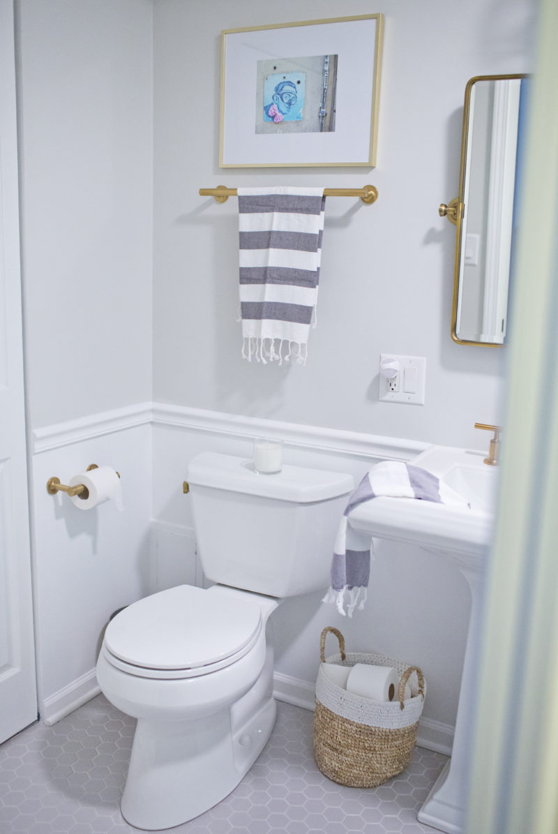
We decided to stick with the greys and whites that we have throughout the whole house. Now, aside from our white bathroom, every wall in our house is some shade of grey (insert 50 Shades of Grey jokes, here). Overkill? Probably. But we like a lot of eclectic–and colorful–furnishings. So, the blank slate works as a good background for us.
We also did two styles of tile that we already have upstairs: hexagon and subway. When we were shopping for homes, one of the weirdest things was when a house had multiple finishes. Like, some houses would have one 50’s-style bathroom with black and white checked tile floors and then another bathroom that looked straight out of a Tuscan villa. So, we wanted some consistency.
We also completely ripped out the disgusting tub, opting for a walk-in shower instead. It feels 10x as large and, since Finn has a tub in his bathroom, we didn’t feel like we needed another downstairs.
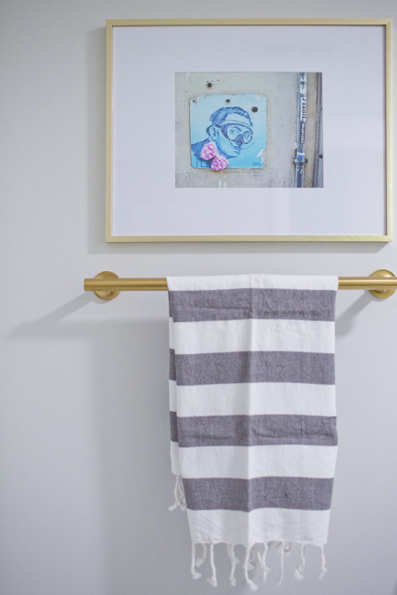
This photo is from our trip to Italy. We have two photographs of this Italian street art in the bathroom, per Sona’s request. (More Italy photos available in my Etsy shop!)
Just like our other baths in the house, we went with gold fixtures. I know it’s trendy. I know it may not date well. But, in the end, we LOVE them, and they can be easily changed. Since all three of our bathrooms are on the smaller side, we felt like having really nice fixtures and lights was necessary to make them feel a bit luxe.
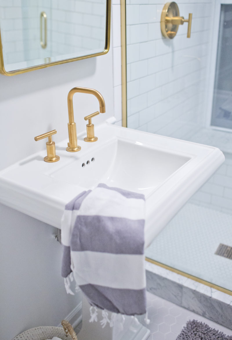
We went with the exact same Kohler pedestal sink that we have in Finn’s bathroom. It’s sleek and saves a TON of room when compared to the bulky vanities that we tore out.
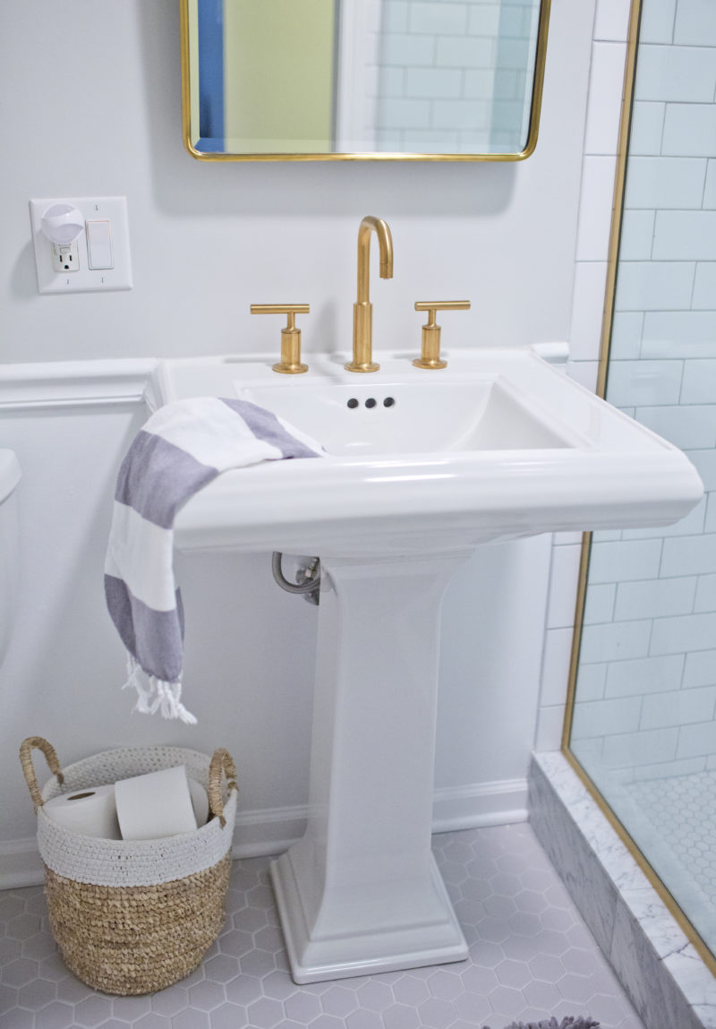
We went back and forth about the floor in the bathroom. We have marble floors in the two upstair baths, but we didn’t want to have a high-maintenance stone in a guest bathroom, as we didn’t want to have to worry about it getting messed up. So, we chose a porcelain hex in a light, cool grey, which I actually really love. Originally, we were going to do this exact same tile on the shower floor, but we opted for the smaller white hex last minute.
We also had planned to do the threshold of the shower in subway tile, but the contractor urged us to choose something wider, ensuring that we didn’t have grout lines on the threshold, which would likely crack over time. We opted for just a teeeeeeeny bit of marble in the shower–on the threshold and in the window seat–and I really love the mix of finishes.
Eventually, we plan to add a really bold wallpaper on the top half, over the chair rail. For now, though, we’re pretty happy with how things turned out. The bathroom is a million times better than it was upon move-in and, although there’s still a lot of little stuff we want to do around the house, it’s nice to have all of the larger reno projects behind us!